A New Look For Shiba Inu
Over the years, this community has seen everything with $SHIB, the wins, the setbacks, and everything in between.
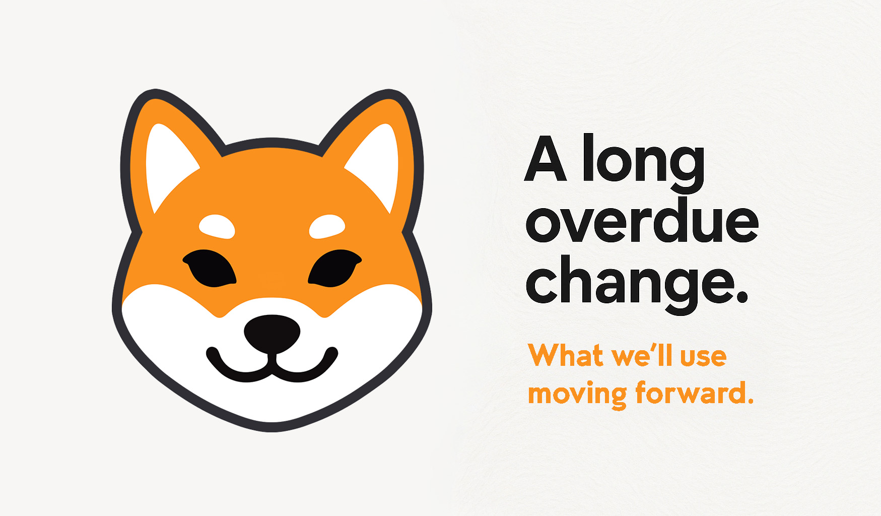
This change was long overdue. The old logo never truly fit, at least for us. It felt out of step, more like something we were stuck with than something we chose. Just as Shiba Inu need to change direction, we decided to give the same treatment. Understand that no individual or self-appointed group gets to decide for the entire community what needs to remain or what is official for $SHIB, including the logo. Others are free to use what they want.
We could've taken this in a completely new direction, but we kept the familiarity that helps with SHIB's visibility. The logo we now intend to use for this site has a clean, modern design with the balance and flexibility the old version lacked, professional enough for global use, but simple enough to work anywhere.
For those who stand with this new design, it's more than a logo, it's a statement. A sign of support for change, and for leaving the old and broken behind.
Over the years, parts of this community have been pulled in the wrong direction by people pushing their own narratives. The old logo became attached to that, and it no longer reflects what SHIB truly stands for. This new logo represents detail and dedication to $SHIB, with nothing else tied to it. It is a step forward. A fresh start. A symbol of unity, clarity, and growth as we continue shaping the future together.
This is how we move forward.
The design is released under CC BY-ND 4.0
Download the logo files here.
Over the years, this community has seen everything with $SHIB, the wins, the setbacks, and everything in between.
This change was long overdue. The old logo never truly fit, at least for us. It felt out of step, more like something we were stuck with than something we chose. Just as Shiba Inu need to change direction, we decided to give the same treatment. Understand that no individual or self-appointed group gets to decide for the entire community what needs to remain or what is official for $SHIB, including the logo. Others are free to use what they want.
We could've taken this in a completely new direction, but we kept the familiarity that helps with SHIB's visibility. The logo we now intend to use for this site has a clean, modern design with the balance and flexibility the old version lacked, professional enough for global use, but simple enough to work anywhere.
For those who stand with this new design, it's more than a logo, it's a statement. A sign of support for change, and for leaving the old and broken behind.
Over the years, parts of this community have been pulled in the wrong direction by people pushing their own narratives. The old logo became attached to that, and it no longer reflects what SHIB truly stands for. This new logo represents detail and dedication to $SHIB, with nothing else tied to it. It is a step forward. A fresh start. A symbol of unity, clarity, and growth as we continue shaping the future together.
This is how we move forward.
The design is released under CC BY-ND 4.0
Download the logo files here.